
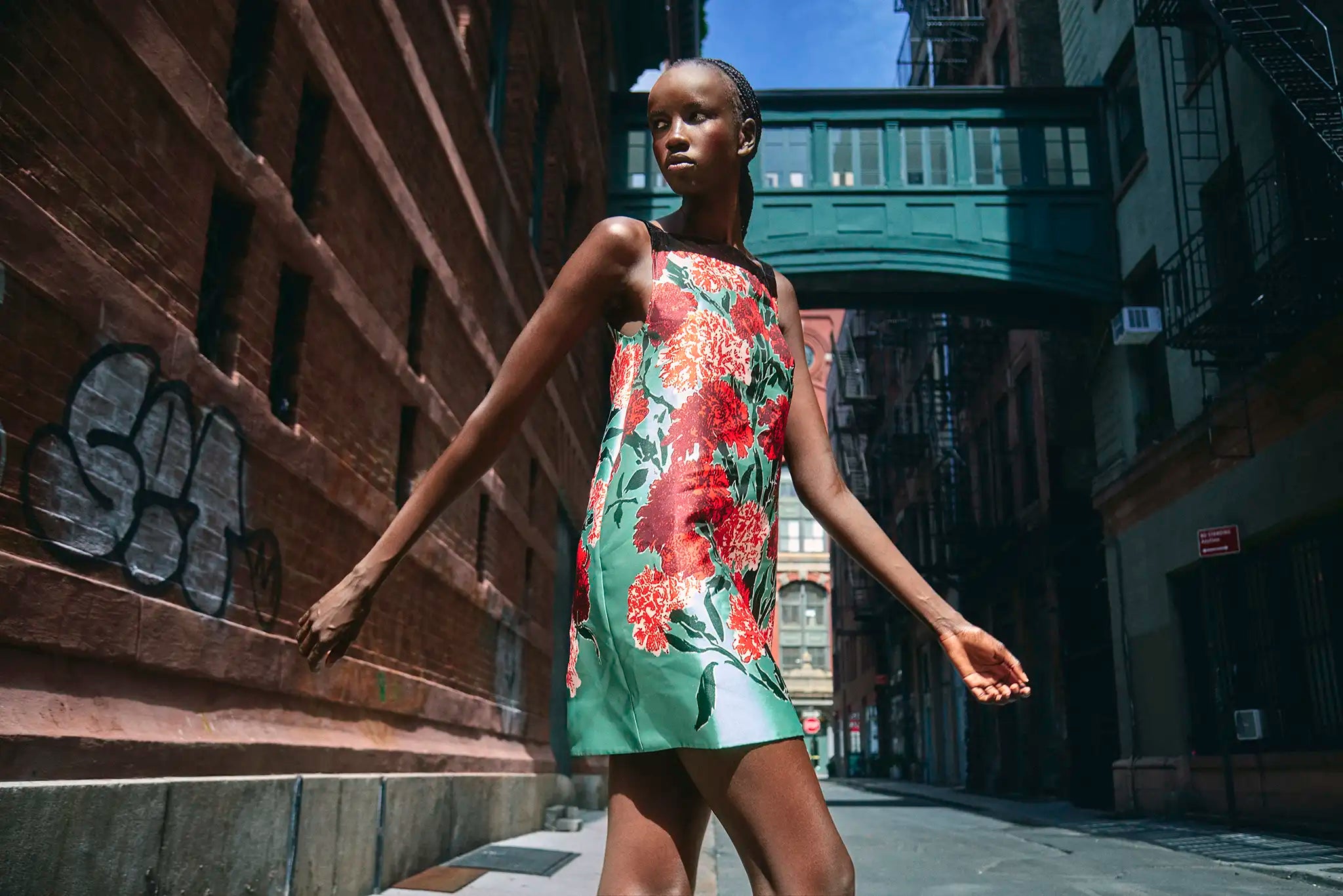
A bold floral is not automatically difficult to wear. The trouble begins when the print, the silhouette, the shoes, and the jewelry all ask for attention at the same volume.
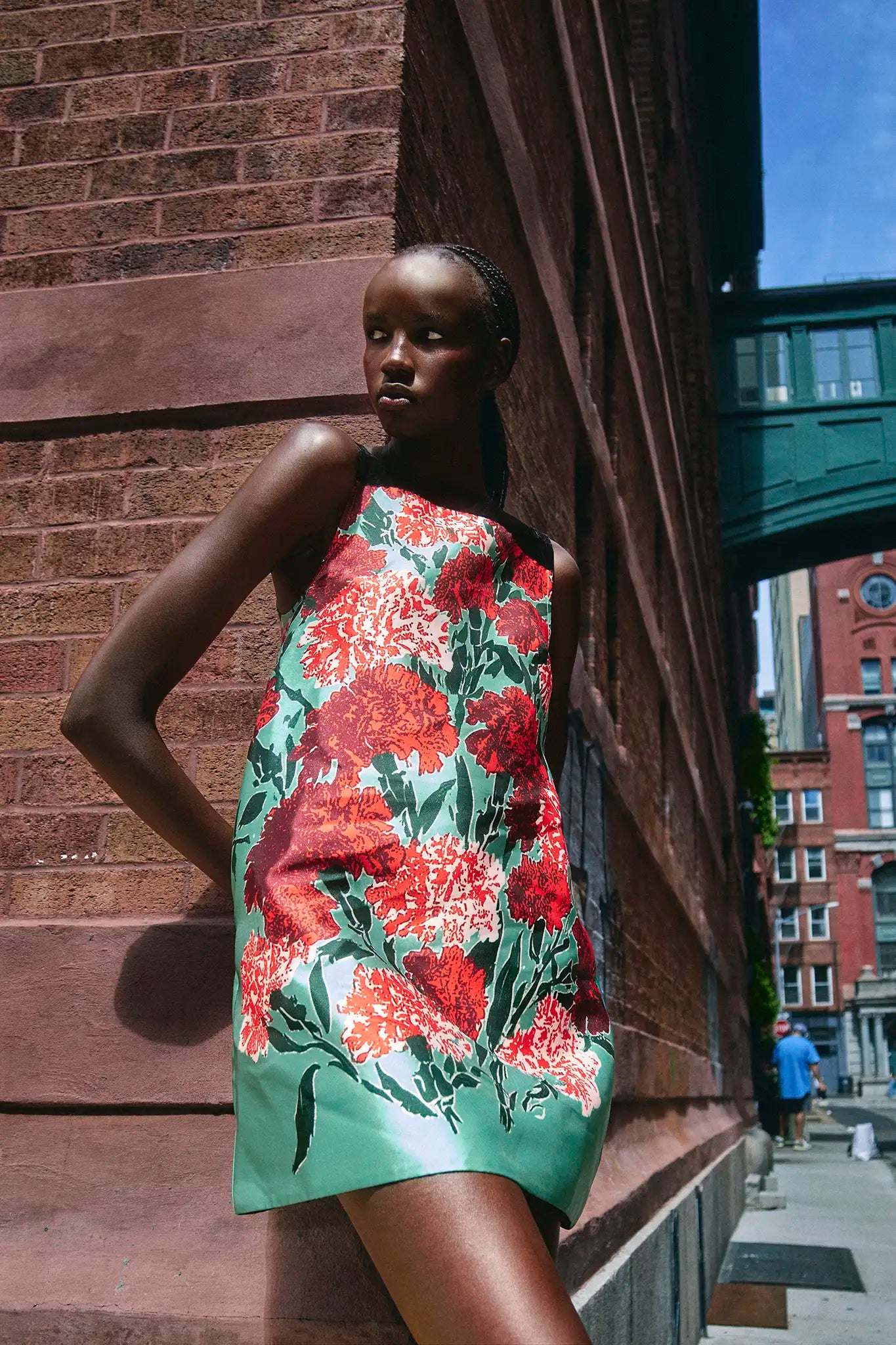
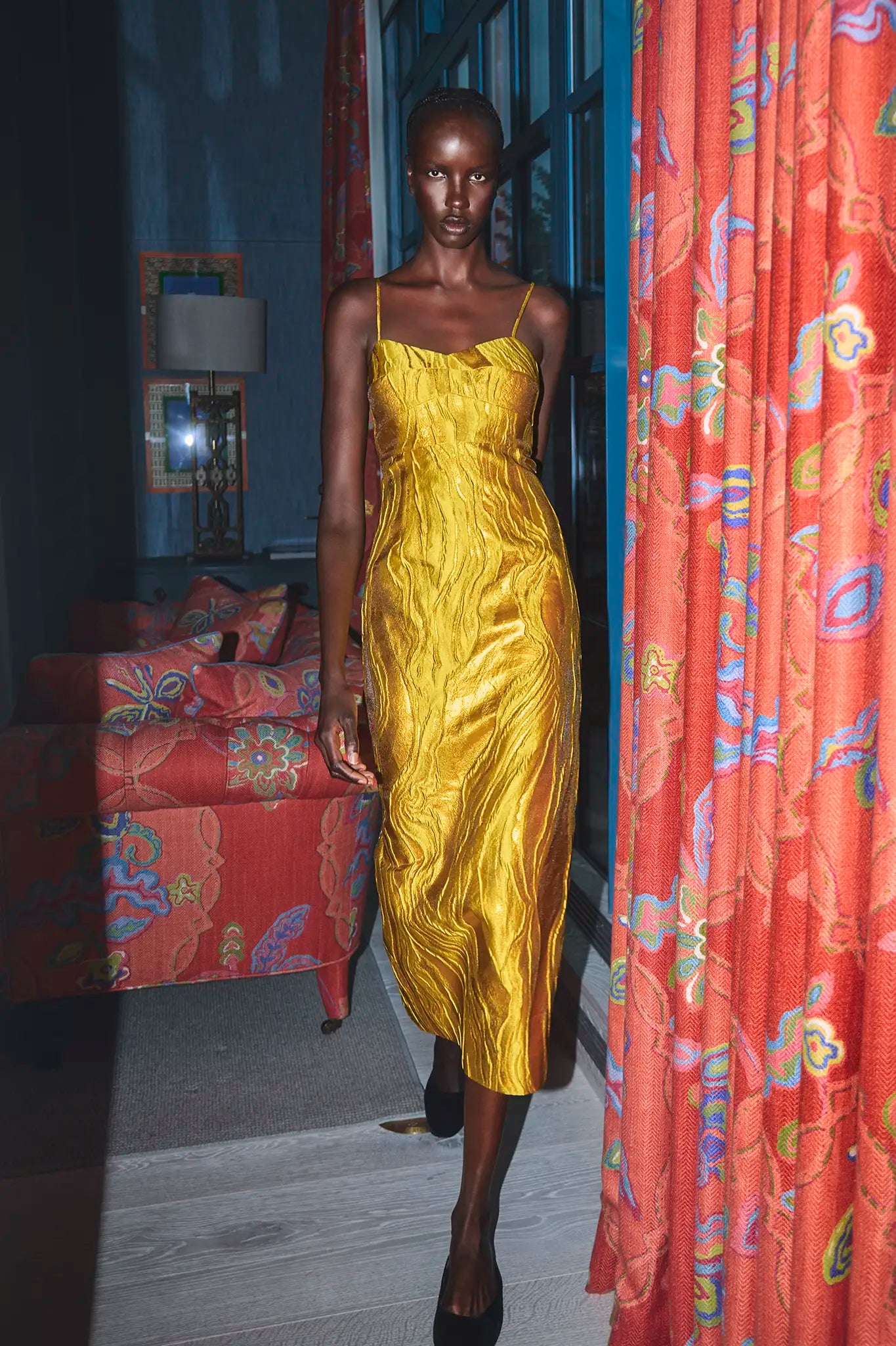
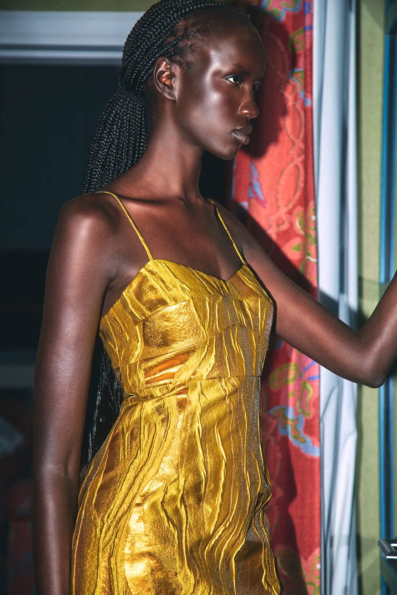
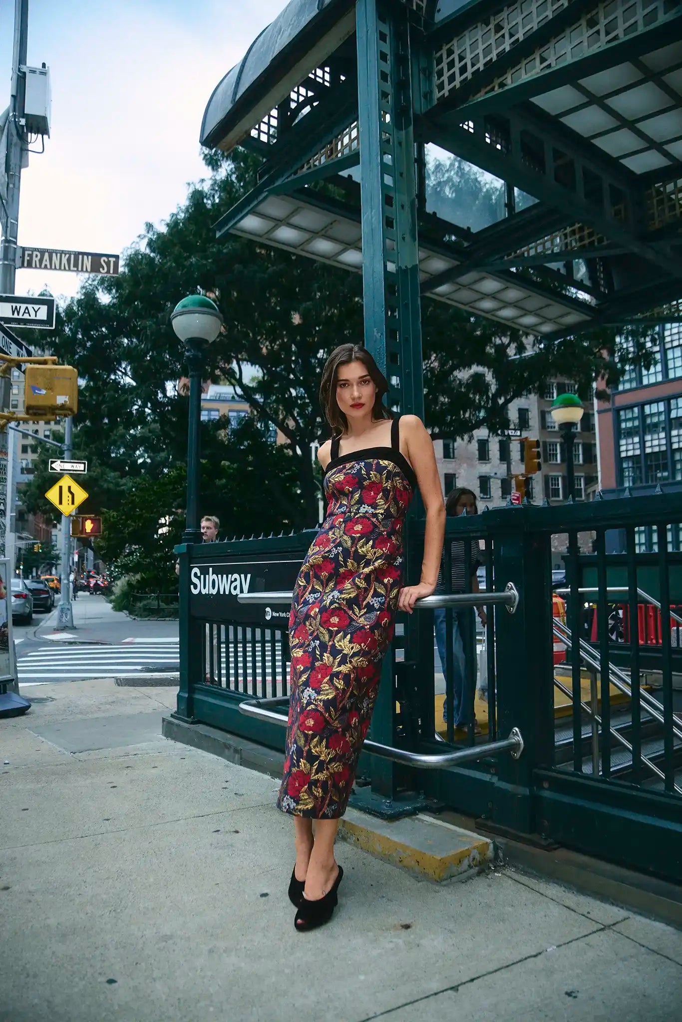
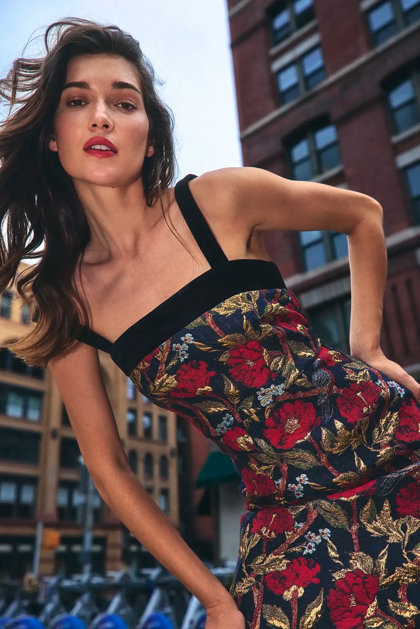
The more useful question is not, “Is this print too much?” It is, “Where does the print stop, and what gives the eye a place to rest?” Hunter Bell’s current holiday pieces make that distinction easy to see. The Roarke dress uses a large botanical motif inside a short, clean shape. The Amal shifts the emphasis to luminous fabric and a longer line. The Gimlet carries a darker floral across a narrow column. Each is expressive, but none needs a pile of accessories to explain itself.
This method starts with scale and placement before color. Once those two are understood, decisions about earrings, shoes, outerwear, and bags become much less mysterious.
Read the print from across the room
Online shopping encourages close inspection. You zoom in on petals, seams, and fabric texture. Outfits are experienced from farther away. Step back from the screen or reduce the product image until the model is only a few inches tall. What remains visible is the real print hierarchy.
Large motifs create fewer, stronger focal points. Small motifs create texture. A large flower placed near the shoulder can pull attention upward; a concentrated print near the hem can add weight lower down. Neither effect is good or bad, but it changes how the dress works with your height, preferred shoe, and the layer you may add later.
Let the silhouette frame the pattern
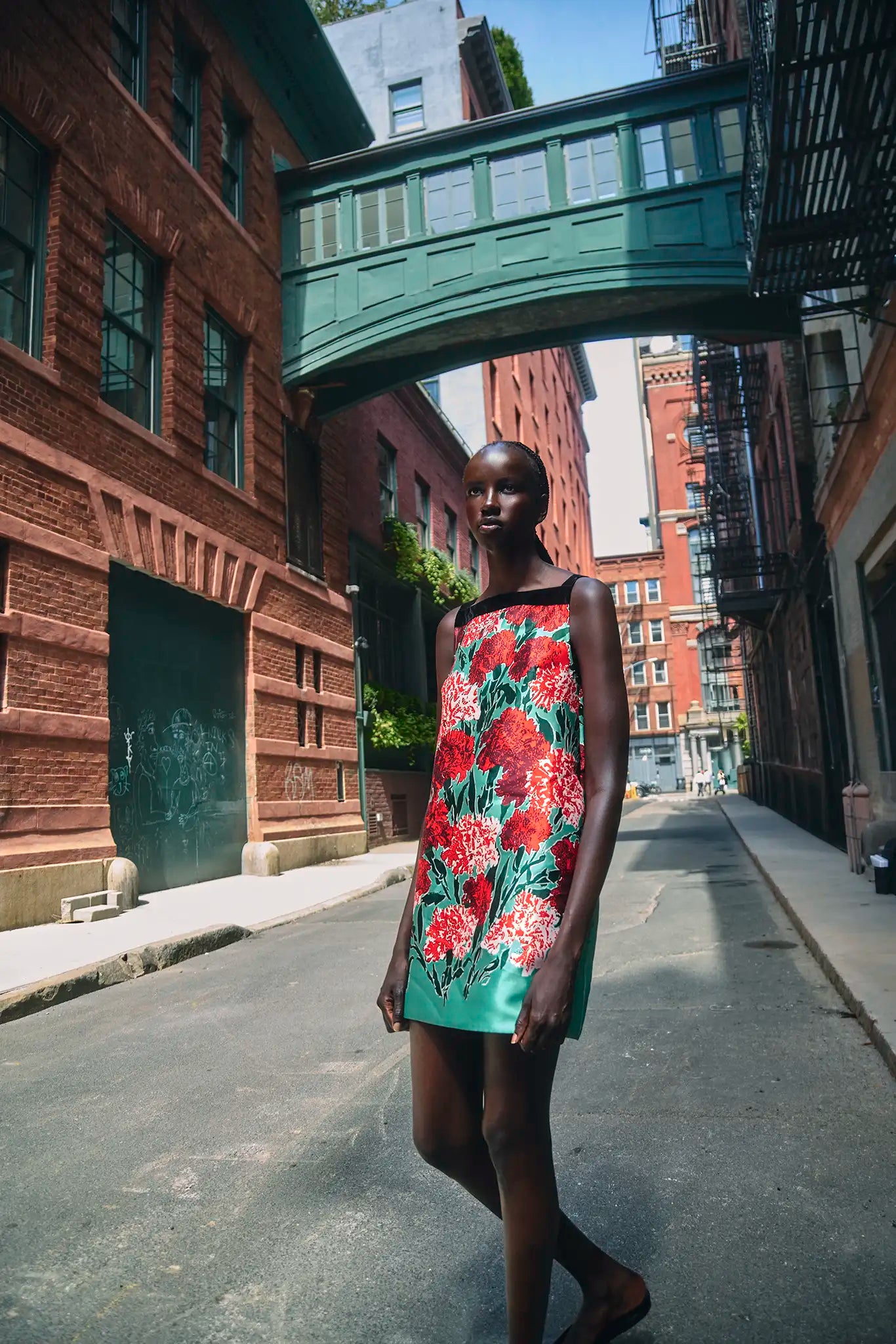
A print does not float independently of the garment. Straight shapes make a botanical motif feel graphic. Ruffles, tiers, gathers, and draping make the same motif feel more romantic because the pattern bends and breaks across the surface. Before adding a jacket or belt, decide whether the silhouette already supplies enough movement.
The Roarke’s sleeveless shift shape gives its floral a crisp boundary. That means a complicated shoe is unnecessary. A clean pump, narrow sandal, or compact ankle boot keeps the outline legible. A heavy platform, wide belt, and ornate earrings would introduce three more shapes into an outfit that already has a strong one.
The rule is especially useful for petite frames. Rather than avoiding a large print, preserve one uninterrupted vertical path. A shoe close to the color of the leg or hem, a compact bag, and an open neckline can keep the print from dividing the body into several short sections.
Change texture before adding another color
When a printed outfit feels unfinished, the instinct is often to introduce a new color. Texture is a quieter way to add depth. Smooth leather, brushed suede, velvet, metallic mesh, and satin each change the mood without expanding the palette.
A floral mini with a polished pump reads sharper than the same dress with a suede boot. A gold jacquard dress needs very little jewelry because the surface already catches light. A darker printed column can handle velvet or patent leather in one small area, but repeating shine on the bag, shoe, earrings, and coat usually flattens the distinction between the pieces.
Pull accessories from the smallest color
Matching the largest color in a print is safe, but often predictable. The more interesting accessory color is usually the smallest one that still appears clearly. It creates a link without turning the outfit into a set.
For a green-and-red floral, a dark neutral shoe keeps the print dominant. A muted red bag can work when the shoe stays quiet. Warm gold jewelry can echo a tiny yellow or ochre accent, provided the metal is repeated only once or twice. Literal matching – green shoes, red bag, floral earrings – makes the eye inventory each item instead of reading one outfit.
The two-echo limit
Choose one secondary color and echo it in no more than two places. A red lip and a red bag are enough. A gold earring and a gold buckle are enough. Everything else can return to a neutral or a texture.
Use outerwear as a border, not a second story
A coat or jacket changes how much of a print remains visible. If only the center panel of a dress shows, the layer becomes a frame. A dark coat makes bright florals feel more evening-ready. A cream or camel coat softens contrast. A cropped jacket can divide a large motif at the waist, which is helpful when the print feels overwhelming but less useful when the garment’s strength is one long uninterrupted line.
Take a photograph with the layer open and closed. The closed view matters because it is how the outfit will look outdoors or on arrival. If the coat introduces another strong pattern, dramatic hardware, or a competing color story, the print may work only after the coat comes off.
The mirror check that catches overstyling
Stand far enough from the mirror to see the whole outline. Name the first three things you notice. Ideally, they are the garment, the face, and one intentional accessory. If you notice the shoe, earrings, bag, belt, and print as separate events, remove one item and repeat the check.
Then sit down. Large prints and short hems can change when the fabric folds across the lap. Check where a bag lands, whether a jacket catches at the hip, and whether the shoe still feels proportionate from a seated angle. These ordinary views are more useful than a perfect front-facing pose.
Before leaving the house
- The print has at least one visible quiet zone.
- The silhouette, rather than a belt, defines the shape.
- Only one accessory introduces a new texture.
- A secondary color is echoed no more than twice.
- The outer layer frames the outfit instead of starting another one.
Bold florals become easier when they are treated as design rather than decoration. Read the scale, protect the outline, and give the eye somewhere to pause. The result can be vivid without feeling busy, which is the difference between wearing a print and letting the print wear everything else.
See the prints at full scale. Review the current Hunter Bell dresses, fabric details, and product measurements before choosing a silhouette.