Red and green are ordinary wardrobe colors until December makes them feel loaded. The way out is not to avoid the combination. It is to change the ratio, the texture, and the distance between them.
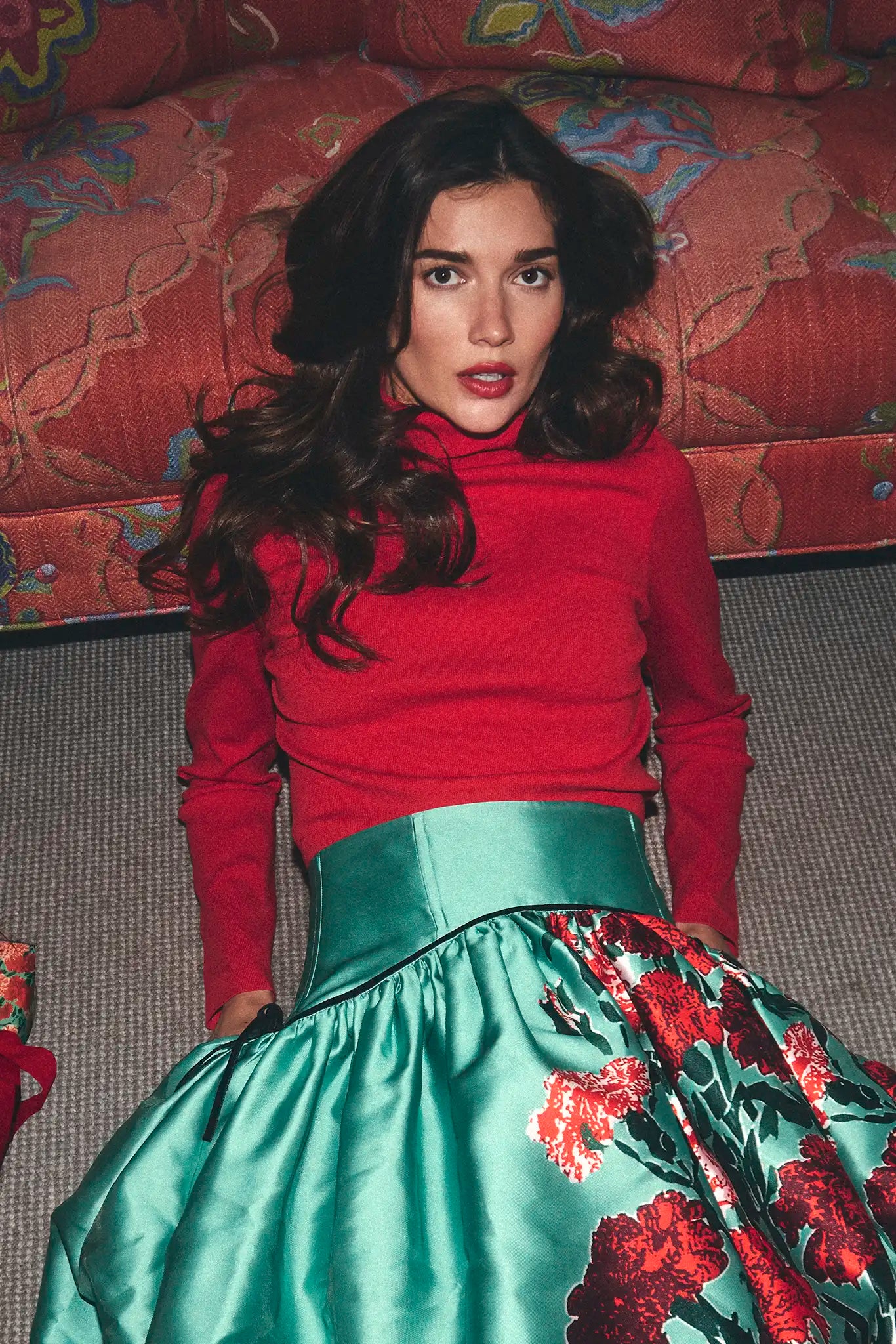
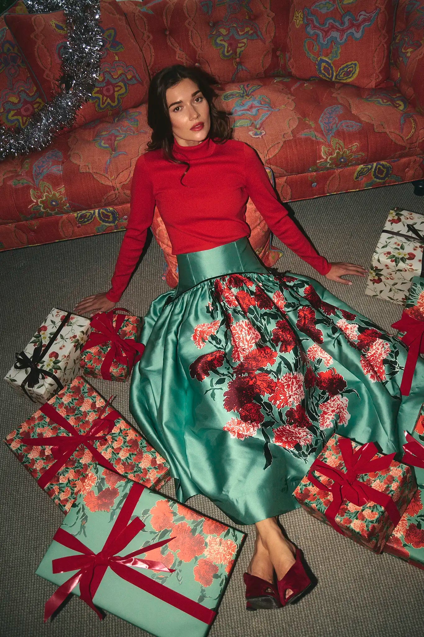
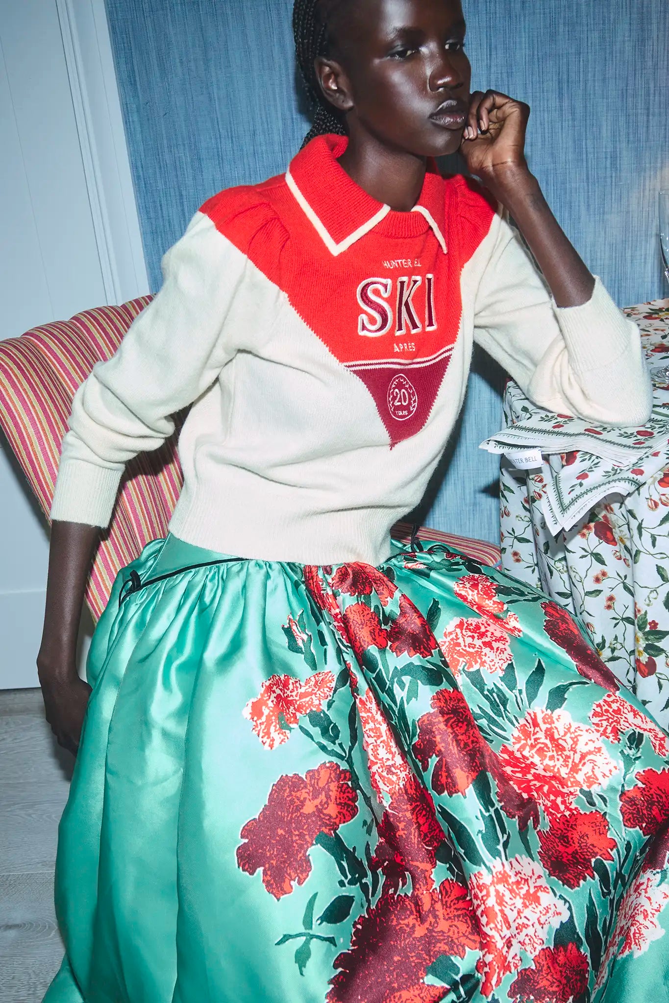
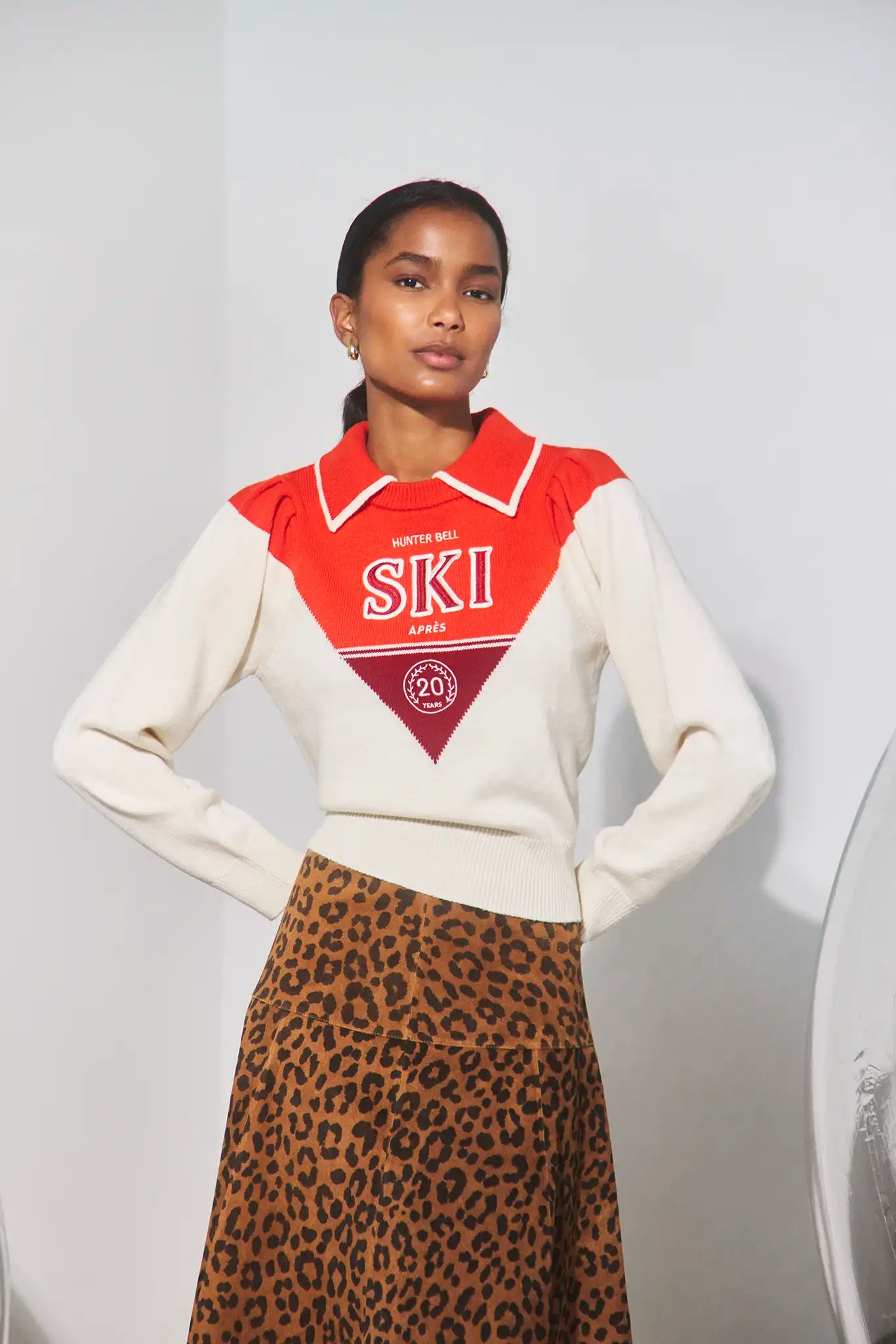
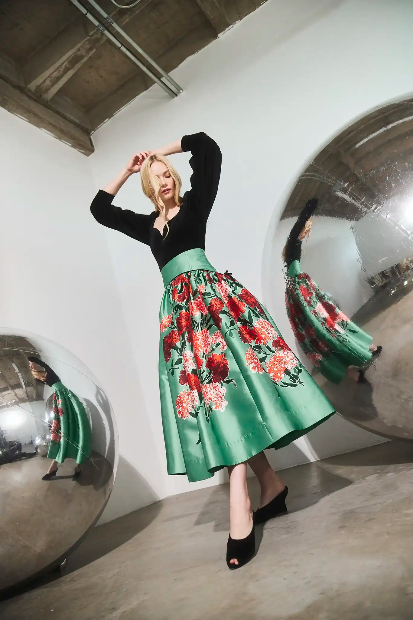
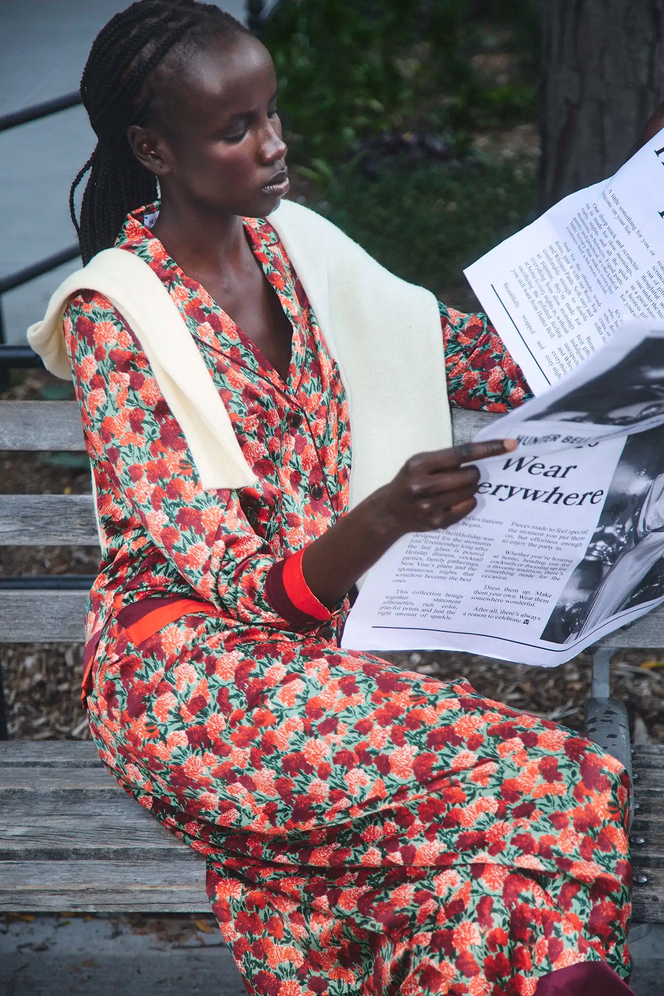
A crimson knit with a green floral skirt can look polished rather than seasonal when one color clearly leads and the other arrives through a print. Hunter Bell’s current separates demonstrate several versions of that idea: a close-fitting red turtleneck over a full patterned skirt, a cream graphic sweater with the same skirt, a black velvet top that removes red entirely, and a floral blouse-and-trouser set where the repetition comes from silhouette rather than layering.
The formula below is meant for real wardrobes. It works whether the hero piece is a designer skirt, a vintage printed trouser, or a bright sweater you already own.
Start with a 60-30-10 color ratio
The familiar decorating ratio translates well to clothing. Let roughly 60 percent of the visible outfit be the dominant color or neutral, 30 percent be the supporting color, and 10 percent be the accent. The numbers are not literal measurements. They are a way to stop three colors from fighting for equal space.
With a long printed skirt, green may already occupy most of the outfit. A red turtleneck becomes the supporting block, while black shoes and a small bag act as the ten-percent anchor. If the sweater is cream with a red motif, cream becomes the dominant color near the face and the pattern is pushed lower. The same skirt suddenly reads as a different outfit because the ratio changed.
Make one piece responsible for volume
Color looks busier when several garments also have volume. A full midi skirt already creates width and movement, so the cleanest partner is a knit that follows the body or tucks without bulk. A boxy sweater can work, but it needs a shorter hem or a deliberate front tuck so the waist does not disappear.
The inverse is true with narrow trousers or a pencil skirt. A fuller sleeve, cropped cardigan, or softly structured sweater can provide shape above. The goal is not to make every body look smaller. It is to make the outfit’s volume readable: one area expands, one area stays controlled.
Solid knit + printed skirt
Choose the least common strong color in the print and repeat it above the waist. The connection feels intentional but not matched. Keep the neckline simple and let earrings sit close to the face.
Cream sweater + printed skirt
A pale knit breaks the red-green association and moves the outfit toward daytime. If the sweater has a graphic motif, treat that motif as the accessory and skip a statement necklace.
Black top + printed skirt
Black gives the print a cleaner evening edge. Texture matters here: velvet absorbs light, satin reflects it, and jersey stays casual. Use only one of those effects at a time.
Use print to separate the colors
Red and green look most literal when they meet as two large solid blocks. A print creates distance. Cream, black, gold, or another ground color sits between the red and green, which allows the combination to feel more layered and less symbolic.
Examine the pattern from several feet away. If red and green merge into a busy middle tone, the top should be quiet. If the pattern has clear areas of background, you can echo one color in the sweater or shoe. Dense patterns need fewer accessories because they already provide small-scale rhythm.
| If the print is… | Choose this knit | Keep accessories… |
|---|---|---|
| Large and high-contrast | Solid, fine gauge, simple neckline | Compact and close to the body |
| Small and evenly repeated | Textured or softly shaped | Slightly bolder in scale |
| Metallic or reflective | Matte and low-detail | Limited to one polished finish |
| Dark-ground floral | Cream, red, or a color pulled from the motif | Anchored with black or deep brown |
Choose the shoe by hem movement
A full skirt hides and reveals the shoe as it moves. That makes a clean toe shape more important than decorative detail. A pointed pump extends the line, a slim ankle strap adds polish, and a compact boot grounds the outfit for colder weather. Very heavy soles can work, but they change the mood from dressed-up to directional.
With trousers, the hem decides more. A wide leg needs enough shoe presence to remain visible. A narrow trouser can take a finer shoe without looking top-heavy. Match the shoe to the silhouette before matching it to the color.
Repeat color through a small layer
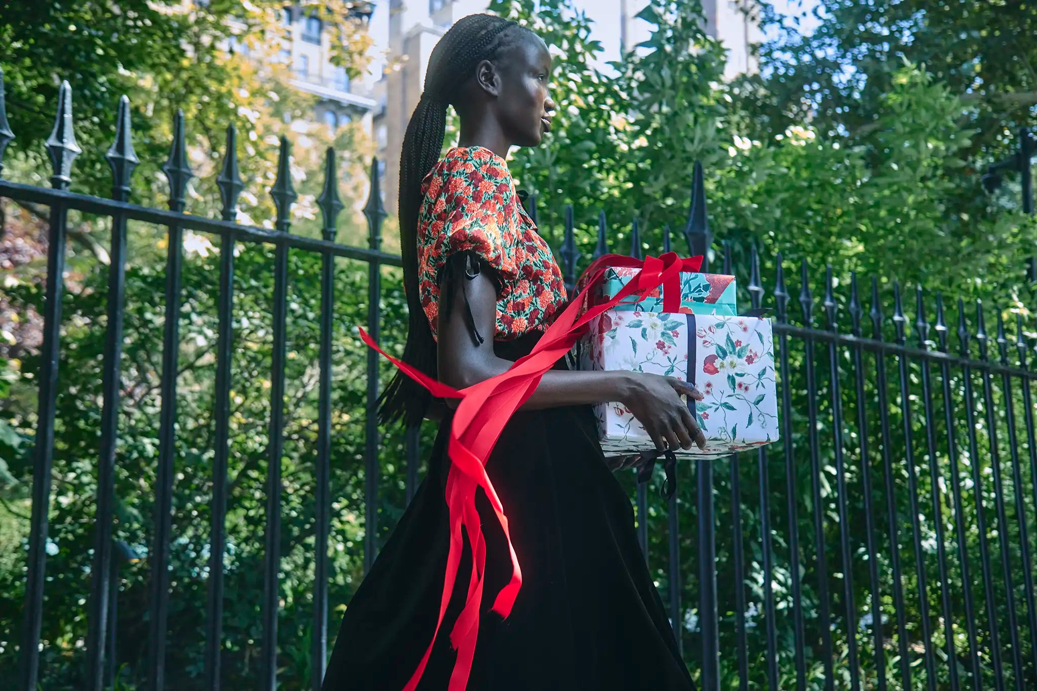
A sweater draped over the shoulders, a scarf tied to a bag, or a narrow ribbon can repeat color without adding another full garment. This is especially useful when the blouse or dress already carries an all-over print. The added layer should clarify the palette, not cover the detail that made the piece worth wearing.
The daylight test
Red can shift from blue-crimson to orange-red under warm indoor light, while greens can move from emerald to teal. Photograph the outfit near a window and again under the lighting where you will wear it. If the colors separate beautifully in daylight but clash at night, replace the accessory nearest the face rather than rebuilding the whole outfit.
A five-piece working wardrobe
The formula does not require a large capsule. One bright fitted knit, one cream graphic sweater, one printed skirt, one dark evening top, and one simple shoe can create several distinct combinations. Add a dark coat and the system travels from daytime lunch to dinner without looking like the same outfit repeated.
Color becomes wearable when every item has one job. The knit establishes the face-framing color. The skirt supplies movement and pattern. The shoe anchors the hem. A small accessory repeats one note, then stops. That restraint is what lets red and green feel like personal style instead of a calendar reference.
Compare the current colors and prints. View Hunter Bell’s latest separates, fabric details, and product measurements before building your combination.